10 Simple Tips for Building the Perfect Landing Page
Use these tips and tricks to optimize the conversion rate of your landing page.
Is your current landing page achieving the results you want? A highly effective landing page should generate leads, secure sales, and turn casual visitors into subscribers – and it can be a powerful weapon in your company’s overall success. Fortunately, there are measures you can take to optimize the conversion rate of your landing page. Here at Red Ape Media, our professionals have taken the time to compile a list of the most practical and potent landing page conversion tips for business owners.
Incorporate Images, Videos, and Animations
Human beings are extremely visual animals, and without eye-catching visuals, your landing page will fail to stand out. High-quality photographs, artwork, videos, and GIFs are a must for anyone building a landing page, and they should complement the written on-page content. You can even use video testimonials to build trust with viewers – just be sure they are of high quality. There are numerous websites offering free stock images, but they usually offer fewer image options than paid sites. Make sure you avoid including too many images and videos – they can become a serious distraction.
Write an Outstanding Headline
Your landing page’s headline will be the first thing your visitors see, so it should make a powerful statement that captures their attention. When writing a headline, keep your audience and the primary topic in mind. An effective headline will convey the benefits of the product, service, or information you are offering. When crafting a headline for your landing page, consider utilizing one of the following title approaches1:
- Problem solving – More than likely, if a person is perusing the products or services offered by your company’s website, they have a problem that needs to be solved. Make it apparent that your company’s products or services are capable of providing a solution.
- Controversy – Controversial headlines, as their name implies, are meant to generate controversy or challenge a popular opinion. These headlines are commanding and meant to grab a potential reader’s attention.
- Sensationalism – These types of headlines make bold statements that pique the curiosity of readers.
- Formula – The most popular type of headlines, formula headlines are concise and attention-grabbing. Formula headlines often start with ‘How to,’ ‘Find out,’ or a numerical value, such as ‘7 Ways to Clean Your Room Quickly.’
For search engine purposes, it is always a great idea to include a primary keyword in your headline. Trigger words – words meant to elicit a strong emotional reaction – can be included for added effect. Examples of trigger words include ‘easy,’ ‘secrets,’ ‘guarantee,’ and ‘free.’
The best landing page headlines are short and to-the-point, and many experts recommend limiting headlines to eight to ten words.
Invest in Top-of-the-Line Web Design
 The overall layout of your landing page is crucial, and if your visitors do not find your page visually appealing, they are unlikely to return. Design elements such as font, background color, the amount of white space, and images can have a huge impact on visitors, so you will need to invest an adequate amount of money in quality design. If you do not feel comfortable designing your own landing page, consider reaching out to a reputable and experienced web design company for assistance.
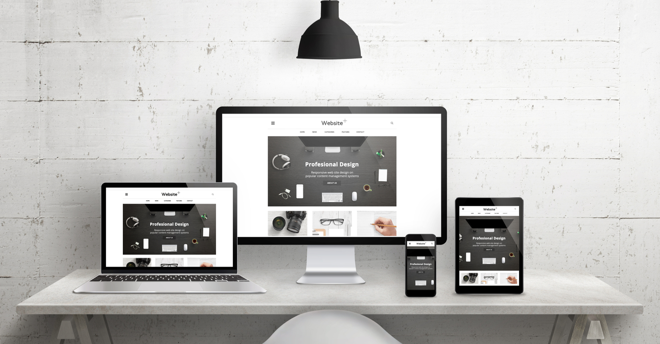
Your landing page should also utilize a mobile-friendly design that allows it to be easily viewed on tablets and smartphones. In today’s constantly connected society, many visitors will be viewing your landing page on a smartphone or tablet. These consumers have little tolerance for websites that are not mobile-friendly.
Use High-Quality Written Content
 There is no doubt about it – high-quality content2 is the cornerstone of any landing page, and producing stellar, authoritative, and unique content should be a major element of your SEO strategy. Unfortunately, many businesses do not understand the true value of content, opting instead to focus on more technical components of SEO. This is counterintuitive, especially as search engine algorithms strive to find sites with the most useful and factually correct information.
In other words, if your content is subpar, no one will be able to find your website. This can be a nightmare for any business, and if you want your landing page to appear in the top search results, the content it contains must be:
- Credible – Establish credibility by including reviews, citations, links to authoritative sites, and well-researched information.
- Engaging – Your content should be interesting and capable of holding the attention of often impatient internet users.
- Superior – The content you post must be more compelling and useful than the content posted on other, similar websites. It should be free of grammatical errors and misspelled words and formatted in an easy-to-read manner.
Headings, subheadings, bullet points, and numbered lists can be used to break landing page content up in an appealing way. Your content should contain thoroughly researched keywords, but they should be used sparingly – never keyword stuff3 your content. Remember, your content’s ultimate goal is to inform; not drive search engine results. No matter how many keywords you use, low-quality content will never rank high.
Include Trust Indicators
It’s no secret – consumers respond more favorably to websites they feel are trustworthy. Building trust between your company and total strangers may seem like a daunting task at first, but it can be done fairly easily. This is especially important if you are selling a product or service online (as opposed to merely capturing leads), and some potential customers may leave your landing page altogether if they do not see any trust indicators.
Certification logos4 from third-party businesses organizations such as VeriSign, BBB, or PayPal can gain the confidence of a potential customer as the logos imply any personal information they provide will be safe. You can also add customer testimonials, business reviews, and social media information to make your landing page seem more trustworthy.
Incorporate the Right Amount of Content
Believe it or not, approximately 55% of visitors to your landing page will spend less than 15 seconds5 on your site. This may sound disheartening to most business owners, but there is a way to get your landing page visitors to spend more time learning about your company. Because you have a limited amount of time to make a positive impression, you will want to post the perfect amount of content on your page.
Too much content can overwhelm visitors, but an insufficient amount can drive them away. It can be beneficial to include more information if your landing page is selling expensive items or provides complex information. Conversely, visitors may prefer less information when shopping for smaller, less expensive items online.
Request a Minimal Amount of Personal Information
As mentioned above, internet users are often impatient, and you can’t expect them to spend too much time viewing your landing page. For this reason, if you want your landing page to capture high-quality leads, you should request the minimum amount of information possible.
In the past, many companies attempted to request information such as phone numbers, basic financial details (‘What is your budget?'), and other types of information many visitors found too personal to provide. To keep your conversion rate high and avoid alienating visitors, do not request any more than an email address6 from potential customers. You can ask about scheduling phone calls or consultations in future emails.
Craft a Compelling Call-to-Action
Every marketer, copywriter, and SEO expert understands the value of an effective and emotionally compelling call-to-action. Placed at the end of a landing page’s content, a call-to-action encourages the reader to take a certain action. Ideally, your call-to-action should be relatively short (only a few words total) and encourage potential customers to:
- Provide personal information.
- Make a purchase.
- Contact the company.
- Create an account on the website.
- Download a document.
Be sure to use verbs such as ‘get,’ ‘call,’ ‘purchase,’ or ‘learn.’ You can also use words or phrases that adequately convey the value of the product or service you are offering, such as ‘Contact me to learn how to monetize your blog now.’
Perform Regular Tests
If you want your landing page to convert, you must test it on a regular basis. Split tests, also known as A/B tests, can show you how individual changes (e.g., changing your call-to-action) impact your conversion rate. On the other hand, multivariate tests can show you how multiple changes impact your rate. Such tests can help you edit and refine your landing page until you achieve your conversion goals.
Minimize On-Page Distractions
Ideally, your landing page should encourage visitors to utilize your products or services – not distract them. Unfortunately, many landing pages feature countless distractions, which are capable of driving visitors away from a website. Multiple links, invasive popups or customer service chat windows, and too many images can lower your SEO ranking and irritate time-conscious potential customers. Your landing page should be clean, responsive, and if you are using online forms, request a minimal amount of information from visitors.
We Can Help You Design the Perfect Landing Page
The perfect landing page is obtainable for most business owners, and with Red Ape Media on your side, it can be within your reach as well. Learn more about web design and development services today.
Sources: